
Friday, July 5, 2013
Growth of Obesity in the US: an Animated GIF
Thursday, June 20, 2013
Volume of People
A coworker recently texted me from a conference asking the volume of a sphere that would contain the world's population. xkcd's "What-if?" has already addressed the area that would be required for everyone to stand (Rhode Island), but now we can stack people.
My question for this was how comfortable the people in my sphere are. There are some seven billion people in the world. In New York City, apartments must be at least 400 square feet, although new "micro-apartments" will be 300 SF. Let's assume each person on the planet lives in a 300 SF studio. With 8-foot ceilings and two feet of structural floor, that's 3,000 cubic feet per person. For all seven billion people, we'd need nearly 150 cubic miles of building, so our giant sphere apartment building would be 6.5 miles in diameter. Let's say 7 miles if we allow for elevators and hallways.

What if the people didn't need to be alive? Instead, let's build a spherical hearse for our 7 billion. People are all different sizes, but on average, our caskets will be 6' by 2' by 1'. Now we're really saving room, and can fit everyone on the planet 0.57 cubic miles. Our sphere is just a hair above a mile in diameter.

"No," my coworker said. "He says it's less than a kilometer." What?? I've stuffed the people about as tight as I can get them. The only way I can pack them tighter is... oh god.


I still don't know why my coworker needed this answer.
My question for this was how comfortable the people in my sphere are. There are some seven billion people in the world. In New York City, apartments must be at least 400 square feet, although new "micro-apartments" will be 300 SF. Let's assume each person on the planet lives in a 300 SF studio. With 8-foot ceilings and two feet of structural floor, that's 3,000 cubic feet per person. For all seven billion people, we'd need nearly 150 cubic miles of building, so our giant sphere apartment building would be 6.5 miles in diameter. Let's say 7 miles if we allow for elevators and hallways.
Like the Technosphere, only 100 times as wide
What if the sphere was instead a future spaceship making some trip to another planet or star system? Cruise ship cabins get as small as 85 SF while Amtrak's sleeper rooms are about 50 SF, and both of these can sleep two. We'll also cut the floor height to 8 feet (with 7 foot ceilings). Depending on the luxury of travel, our sphere needs to be 2.6 to 3.1 miles across now. Maybe a little more if we have life support and engines.
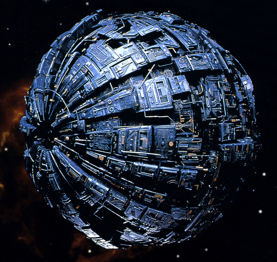
Like a Borg sphere scout, but 6 times as wide. Slightly larger volume than a Borg cube, but definitely smaller than a Death Star.
Like if Harold Chasen got a hold of these concept cars, and also made them 500 times as wide.
"No," my coworker said. "He says it's less than a kilometer." What?? I've stuffed the people about as tight as I can get them. The only way I can pack them tighter is... oh god.
Only not with ice.
The volume of a person is about 66 liters, or 2.33 cubic feet. If you liquefy the human race and pour them into a spherical tank, all of humanity will fit in a diameter of 0.6 miles -- like from the White House to the Washington Monument.
Now we just need to fill that sphere.
I still don't know why my coworker needed this answer.
Sunday, June 2, 2013
Income by Subway Station
In April, the New Yorker ran a piece about income inequality along each of the subway lines, in which they made an interactive graphic portraying the median household income (from census data) at each of the subway stops on the line selected. For example, this is their graph for the F line.

It is an interesting exercise and produces some potentially informative graphics. However, in determining household income, the New Yorker used a... I'll be polite: "unusual" technique. They simply used the income value for the census tract in which their coordinates for the subway station lay. This results in a number of problems.
Census tracts must be between 1,200 and 8,000 people, and most in New York seem to be mostly in the 2,000 to 5,000 range. They vary in size as population density changes, but in New York are generally 1/16 to 1/4 square mile -- on the order of 8 blocks. Many of the subway stations, like Columbus Circle or Carroll St have entrances 3 blocks apart from each other and in two different districts. This means that the New Yorker's analysis would produce different income values based simply on which stairway they chose to mark the station. The amazing thing is that they celebrate these statistical artifacts:
In my analysis (you can argue with me if you want), I created a linearly decaying income weighting function, out to 1/2 mile (2.5 avenues or 10 blocks in Manhattan). What this means is that tracts with a center on top of a given station get full weight, those 1/4 mile away get half weight, and those 1/2 mile or more have no influence. It is important to note that the weighting values in the average for the tracts are relative to the values for all other tracts for a given station. So for example, if a station is surrounded by 6 tracts, all with centers 1/4 mile away, all 6 would count equally towards the station's average income. If there's two at 1/4 mile and two at 3/4 mile, the closer ones will influence the average by three times as much as the farther ones.
Thus, I get a map with the following median incomes. I have not created a line-by-line graphic like the New Yorker, but the data's all there if someone wants to be clever (see borough names below).
You can also explore a full screen version of the map.
The first thing you'll notice is that the income along the lines is much smoother in this analysis. The Fulton-Chambers difference is now $50,000, not $142,000. The really big differences that remain are for stops actually separated by large distances. The 4 largest (I believe) are the 4/5's 86th-125th St difference of over $100,00; The 2/3's Chambers-14th of $65,000; the A/D's Columbus-125th of $65,000; and the F's York-E.B'way of almost $60,000 across the East River. The greatest change for stops that are actually near each other is on the Upper East Side, when the income drops from $158k-$133k-$91k-$43k-$29k on 77th-86th-96th-103rd-116th Streets. And poor Sutter Avenue on the L remains $12,000 less than any of its neighbors or anywhere in Brooklyn.
Since this technique involved comparing the distance between every station to every census tract (using data from the American Fact Finder), I broke the analysis down by borough to avoid creating a truly gigantic matrix. For Manhattan and the Bronx, this is fine because no one walks across the East or Harlem Rivers to catch a train. In Brooklyn and Queens, there may be some loss of accuracy along the border, since for example, no Brooklyn tracts are counted in the Seneca Ave M station, but there are few stations where this could really have an impact, and the data do not seem unusual.
I will not claim that this is the best way to analyze. Maybe I should have a larger or smaller decay distance than 1/2 mile. Maybe I should have used a different decay function than linear. Maybe no decay function at all and simply give every tract with centers within 1/2 mile of the station full weight. Maybe I should have even divided the map up into Voronoi polygons with one station in each and assign each census tract to exactly one subway stop. But at any rate, this analysis produces more realistic and informative result than the technique used by the New Yorker.
It is an interesting exercise and produces some potentially informative graphics. However, in determining household income, the New Yorker used a... I'll be polite: "unusual" technique. They simply used the income value for the census tract in which their coordinates for the subway station lay. This results in a number of problems.
Census tracts must be between 1,200 and 8,000 people, and most in New York seem to be mostly in the 2,000 to 5,000 range. They vary in size as population density changes, but in New York are generally 1/16 to 1/4 square mile -- on the order of 8 blocks. Many of the subway stations, like Columbus Circle or Carroll St have entrances 3 blocks apart from each other and in two different districts. This means that the New Yorker's analysis would produce different income values based simply on which stairway they chose to mark the station. The amazing thing is that they celebrate these statistical artifacts:
$142,265—The largest gap in median household income between two consecutive subway stations on the same line (between Fulton Street and Chambers Street on the A and the C lines, in Lower Manhattan).As a first correction, we should at least average all of the census tracts that actually have subway stairs in them. But what about other nearby ones? How far out should we go? Should neighboring tracts count in our average the same amount as slightly more distant ones?
In my analysis (you can argue with me if you want), I created a linearly decaying income weighting function, out to 1/2 mile (2.5 avenues or 10 blocks in Manhattan). What this means is that tracts with a center on top of a given station get full weight, those 1/4 mile away get half weight, and those 1/2 mile or more have no influence. It is important to note that the weighting values in the average for the tracts are relative to the values for all other tracts for a given station. So for example, if a station is surrounded by 6 tracts, all with centers 1/4 mile away, all 6 would count equally towards the station's average income. If there's two at 1/4 mile and two at 3/4 mile, the closer ones will influence the average by three times as much as the farther ones.
Thus, I get a map with the following median incomes. I have not created a line-by-line graphic like the New Yorker, but the data's all there if someone wants to be clever (see borough names below).
You can also explore a full screen version of the map.
The first thing you'll notice is that the income along the lines is much smoother in this analysis. The Fulton-Chambers difference is now $50,000, not $142,000. The really big differences that remain are for stops actually separated by large distances. The 4 largest (I believe) are the 4/5's 86th-125th St difference of over $100,00; The 2/3's Chambers-14th of $65,000; the A/D's Columbus-125th of $65,000; and the F's York-E.B'way of almost $60,000 across the East River. The greatest change for stops that are actually near each other is on the Upper East Side, when the income drops from $158k-$133k-$91k-$43k-$29k on 77th-86th-96th-103rd-116th Streets. And poor Sutter Avenue on the L remains $12,000 less than any of its neighbors or anywhere in Brooklyn.
Since this technique involved comparing the distance between every station to every census tract (using data from the American Fact Finder), I broke the analysis down by borough to avoid creating a truly gigantic matrix. For Manhattan and the Bronx, this is fine because no one walks across the East or Harlem Rivers to catch a train. In Brooklyn and Queens, there may be some loss of accuracy along the border, since for example, no Brooklyn tracts are counted in the Seneca Ave M station, but there are few stations where this could really have an impact, and the data do not seem unusual.
I will not claim that this is the best way to analyze. Maybe I should have a larger or smaller decay distance than 1/2 mile. Maybe I should have used a different decay function than linear. Maybe no decay function at all and simply give every tract with centers within 1/2 mile of the station full weight. Maybe I should have even divided the map up into Voronoi polygons with one station in each and assign each census tract to exactly one subway stop. But at any rate, this analysis produces more realistic and informative result than the technique used by the New Yorker.
Subscribe to:
Posts (Atom)